
Art Direction, UI/UX, Branding & Strategy - Fashion, 2016 - 2020
Dedicated to quality and environment, Asphalte is a french fashion brand creating strong and timeless clothing for men. Fresh new at the time, company’s concept was built around surveys and pre-orders. The main challenge: Making the concept easy to understand and invite users to engage with the brand. Bold, straight to the point, Asphalte is surely the most influent and successful of its league.
—— 01. BRANDING
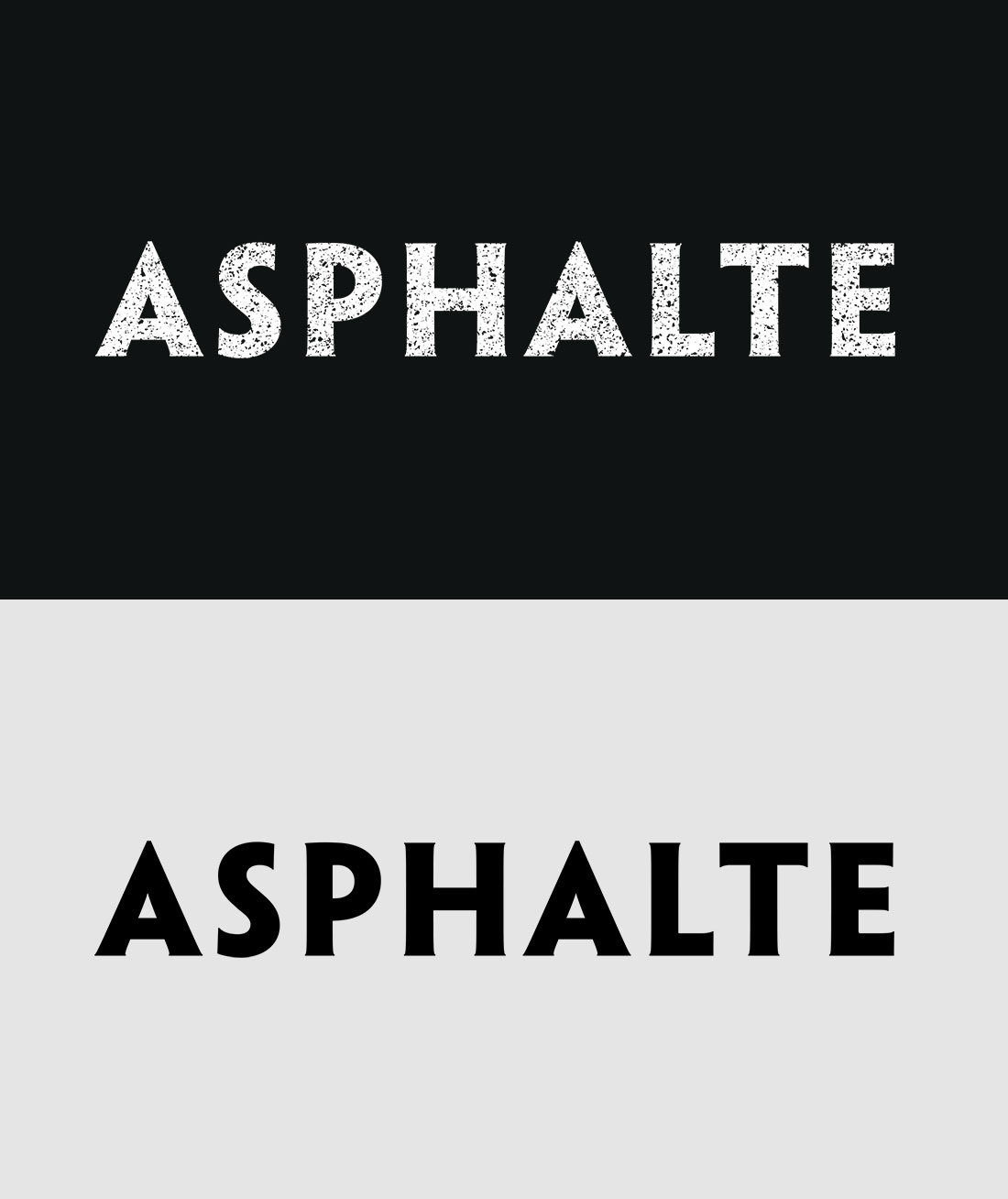
Logotype - Textured / plain
Typography - Titles and copy

Qanelas Soft Black

Roboto Regular
Tone of voice
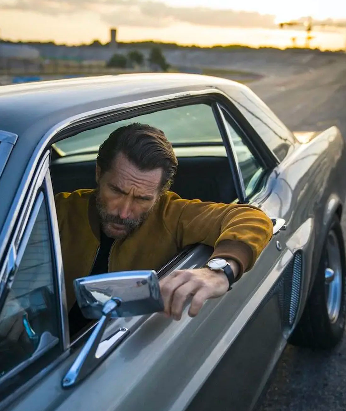
Upfront, Asphalte speaks bold, playful and friendly
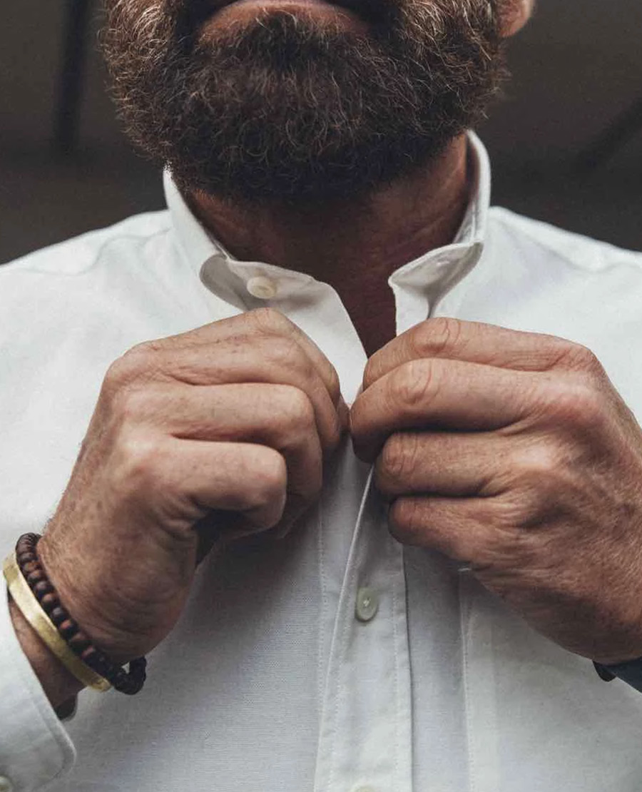
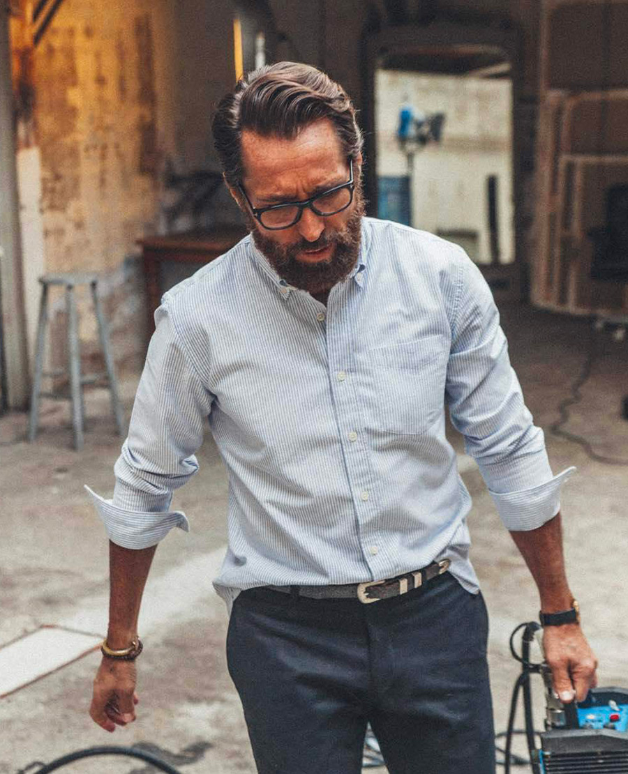
Meanwhile the brand is expert, transparent and visionary.
—— 02. WEBSITE
UI/UX - Desktop & mobile
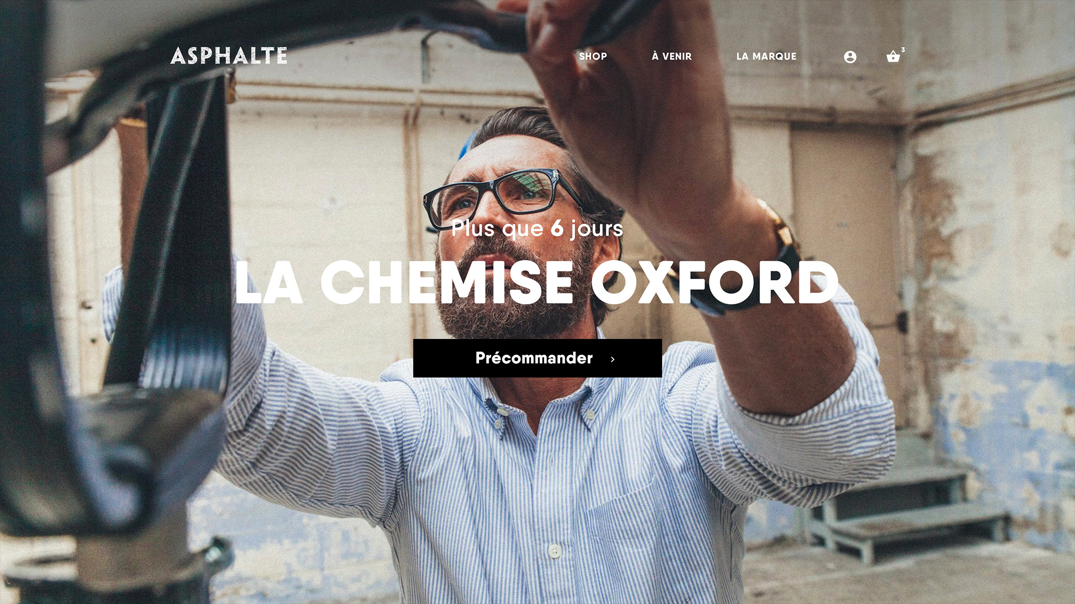

Structure and content allied to help the user stay focus.
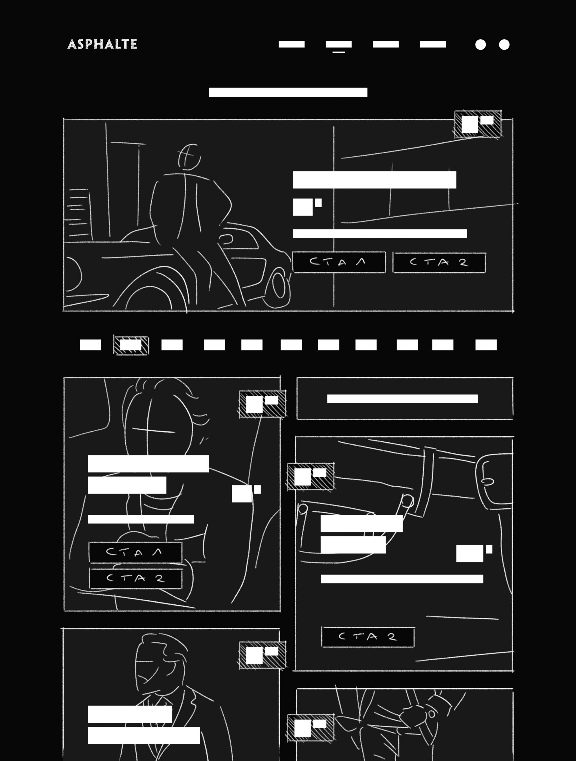
Tone of voice, catchy titles, short sentences.. There are many ways to keep the user reading and memorizing informations or concepts. It gets even better with a page structure made to set the content in a entertaining yet logical way and a memory-friendly user experience to create a fluid navigation.
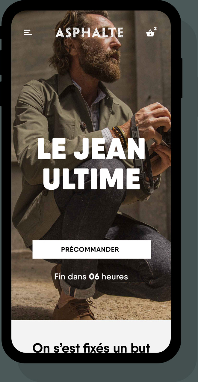
Every single page is created with the same goal, allowing the user to quickly memorize first level informations. Whole brand concept is based on release calendar and timers which implies specific content and call-to-actions hierarchisation.

—— 03. LABEL & PRINT
Label design
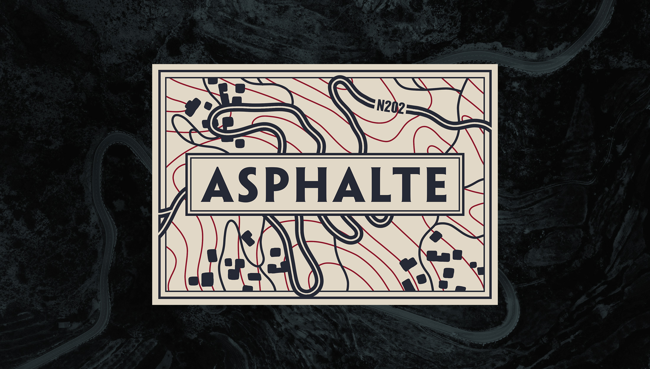
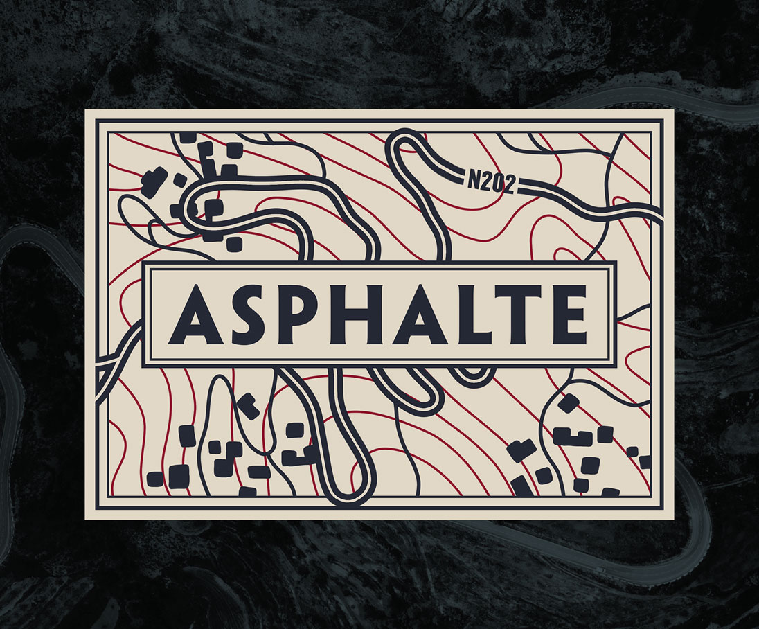
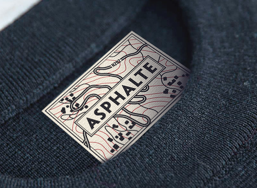
Hit the roads
Asphalte clothing is designed to last and follow its owner where the roads take him. The map representation of N202 road segment is made to celebrate this statement. It is one the most famous part of the most beautiful road in France, connecting the french rivieira to the Alps.
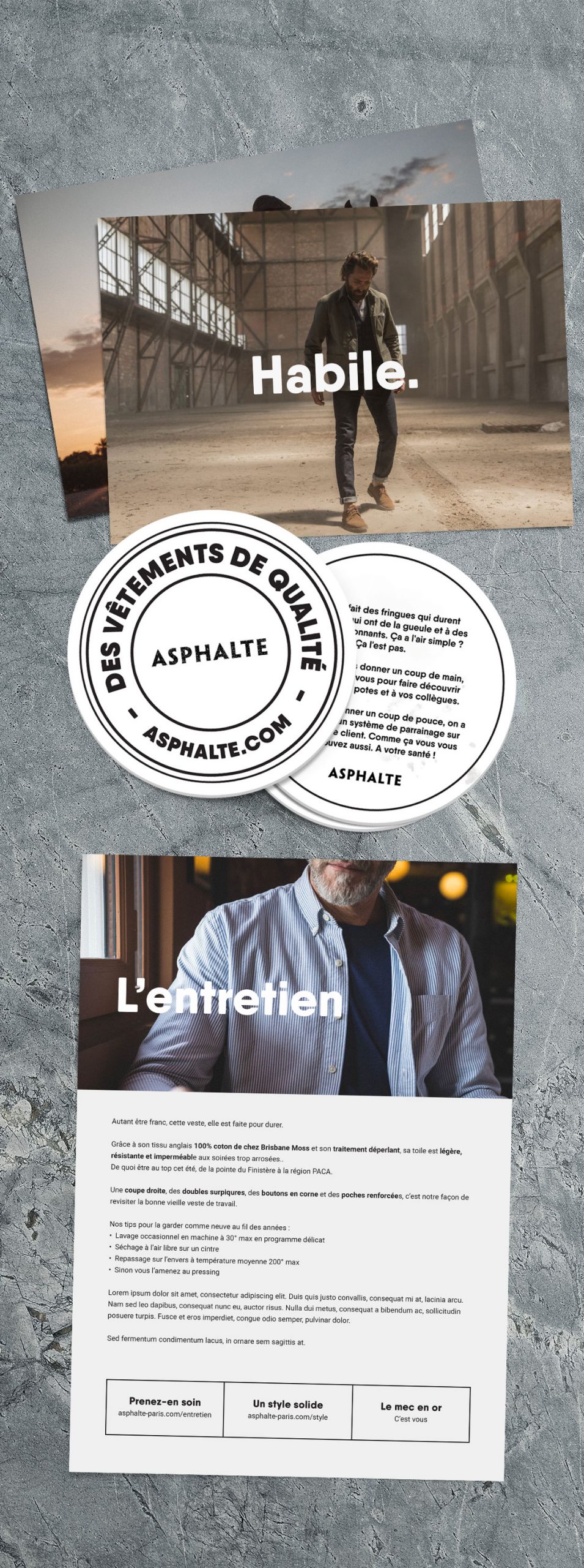
Print - Cards, flyers, bocks
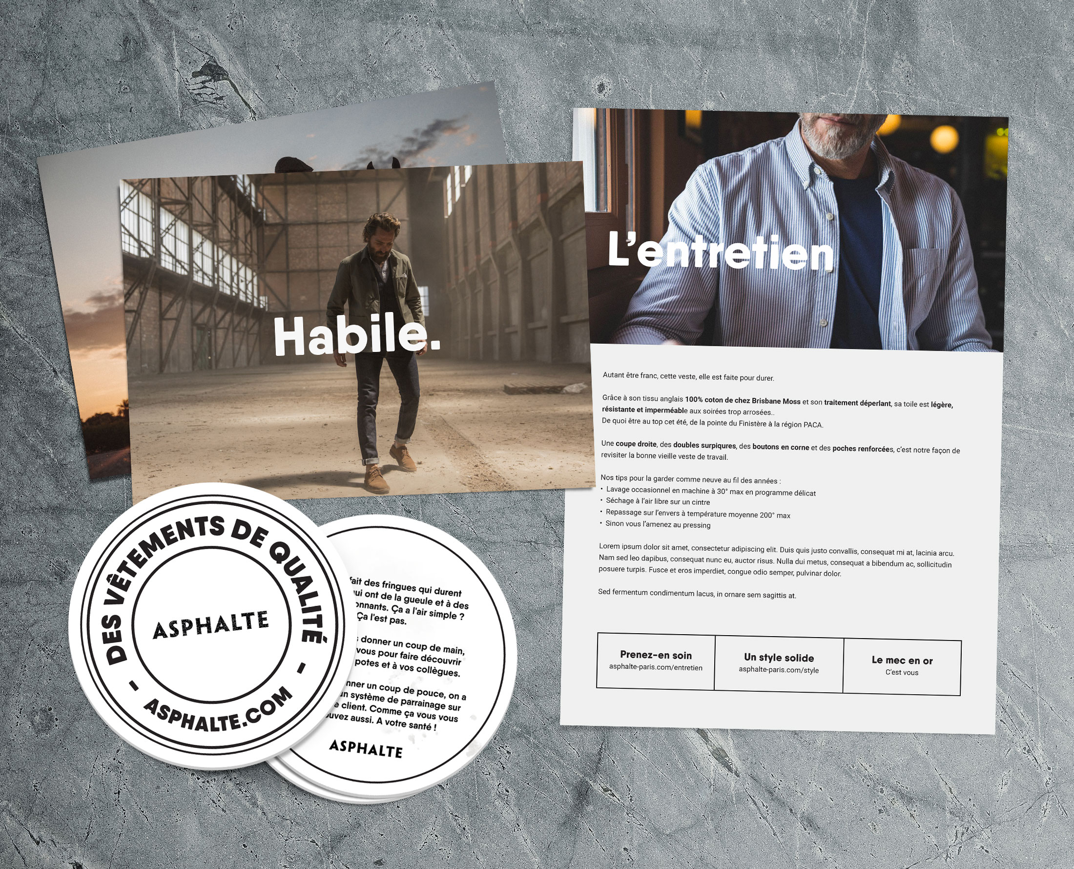
Print - Cards, flyers, bocks
—— 04. ECRM
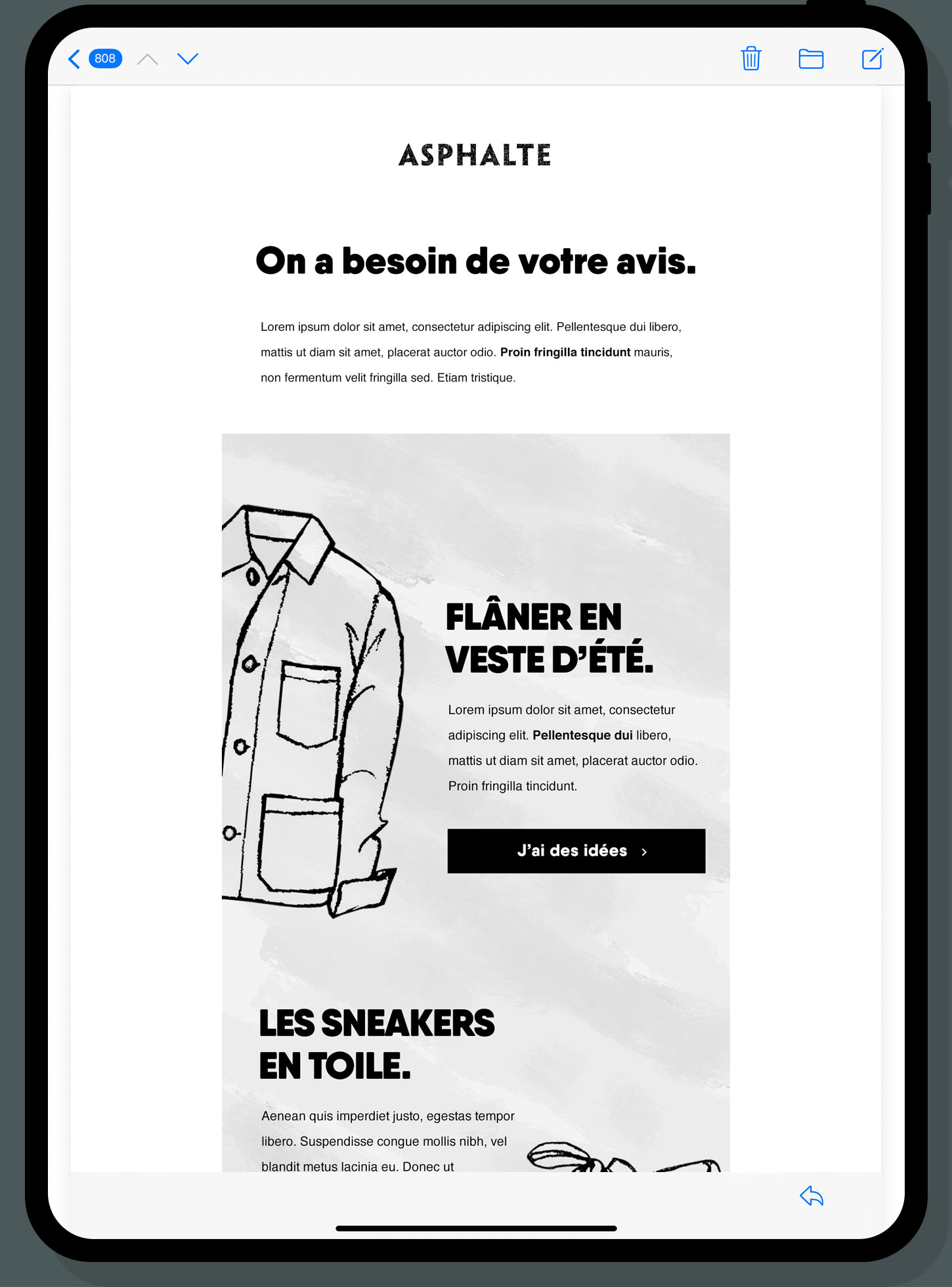
Email design
Asphalte’s whole concept induces specific timing, from conception to delivery. Surveys, project monitoring, automatic emails, campaigns, the brand needs to keep engaging its community and customers. Emails are designed to inform and entertain.
Thank you for your time!
2022
2022
