

UI/UX, Branding - Fashion, 2021
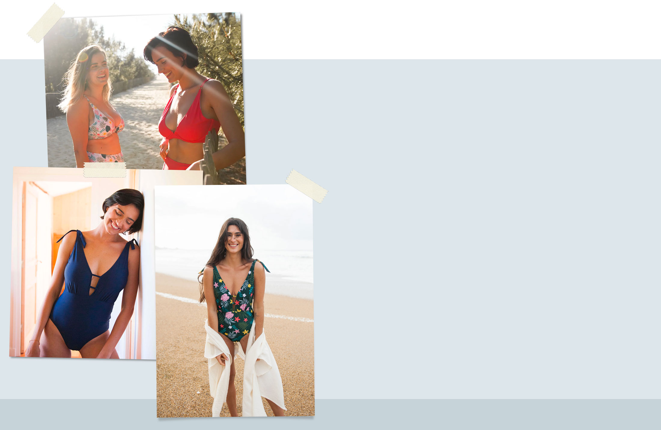
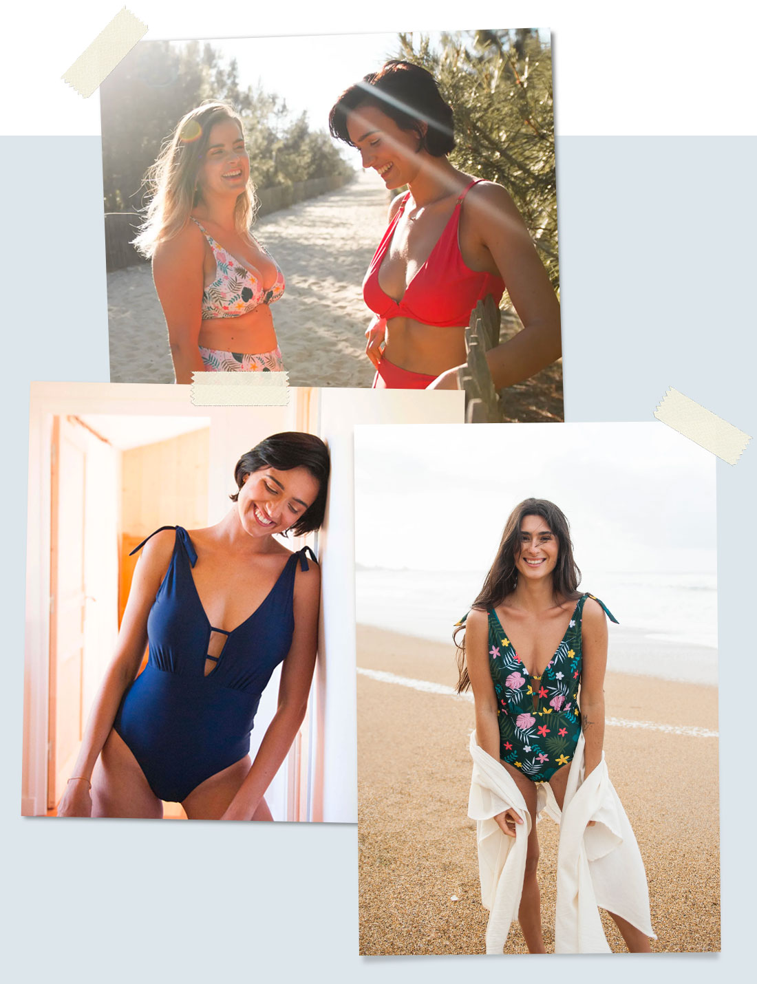
Les Sirènes is a french women’s swim wear / beach wear brand. Made in Portugal from recycled materials, the brand clothes are built with the attention to details and to fit every body type. With a body positive philosophy, the company is buidling a strong community to interact with.
—— 01. BRANDING
Logotype
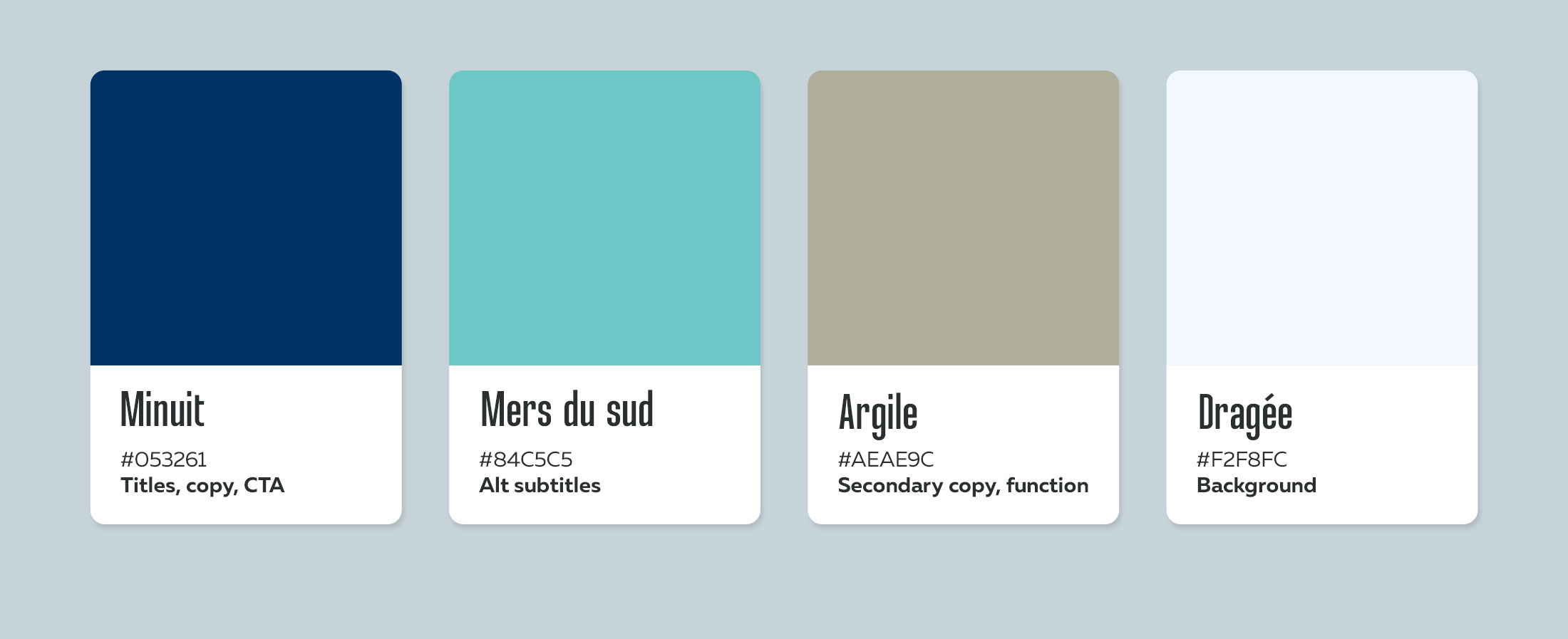
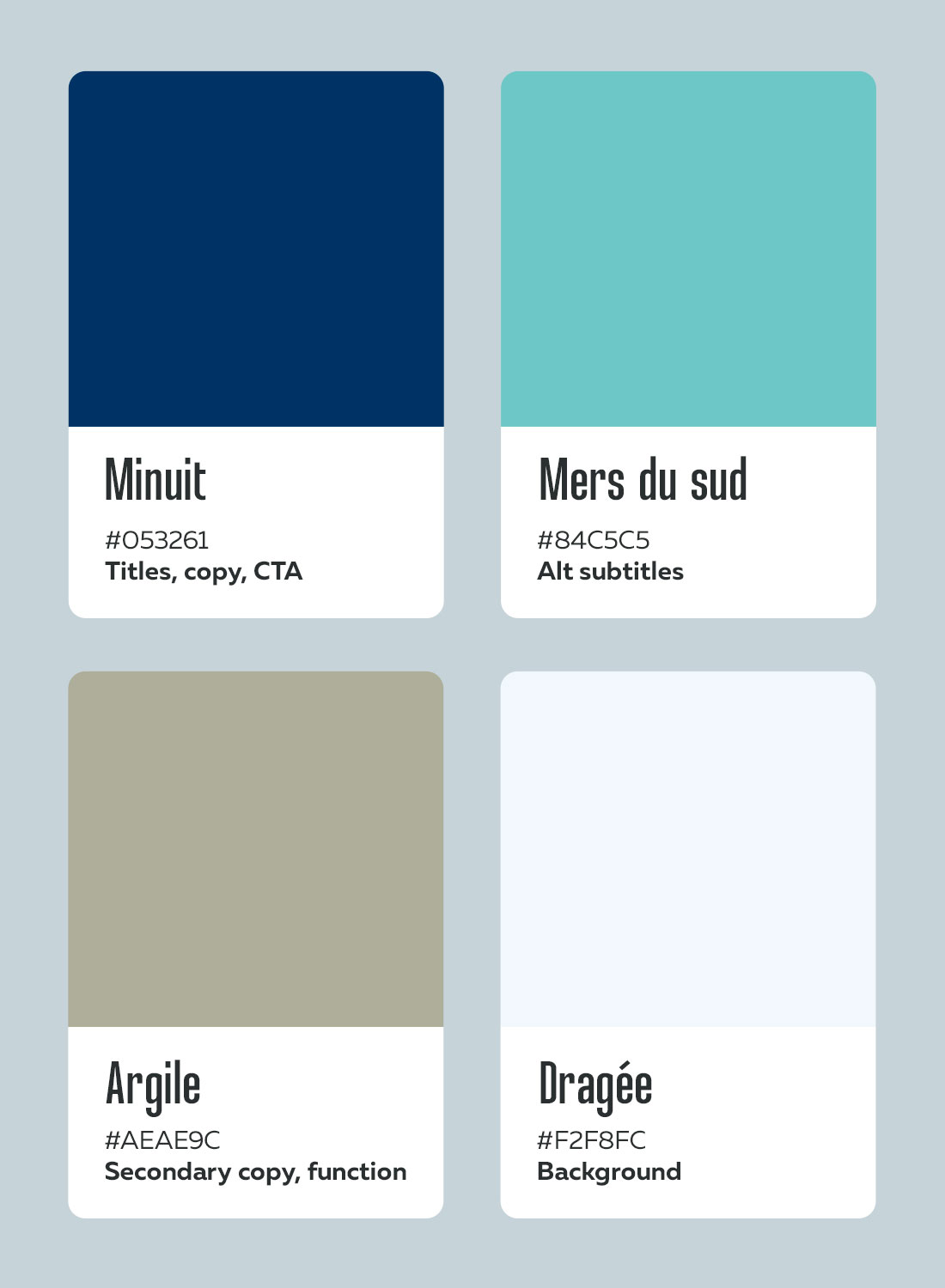
Inspired by the French Riviera, Les Sirènes color scheme is an ode to holidays, to the sea
Inspired by the French Riviera, Les Sirènes color scheme is an ode to holidays, to the sea
Colors - Palette & purpose
Typography
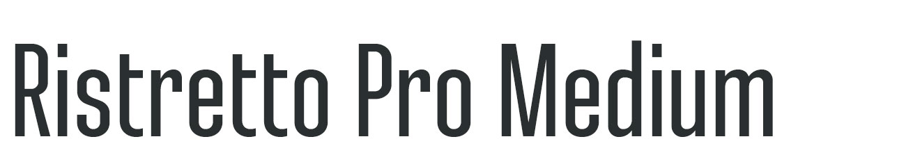
Titles
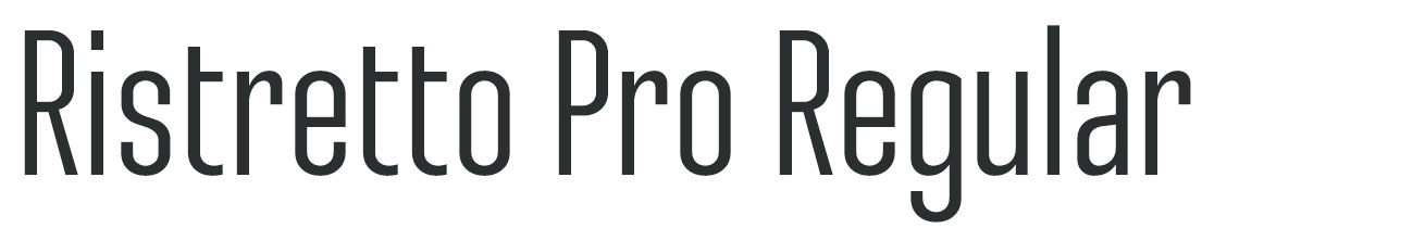
Subtitles
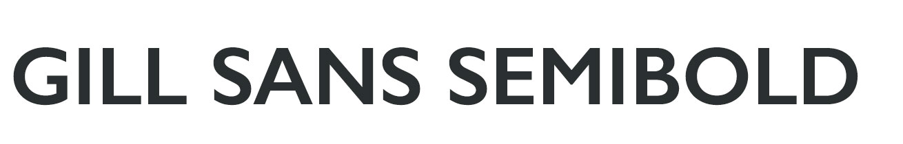
Menu items

Copy
—— 02. WEBSITE
UI/UX - Desktop
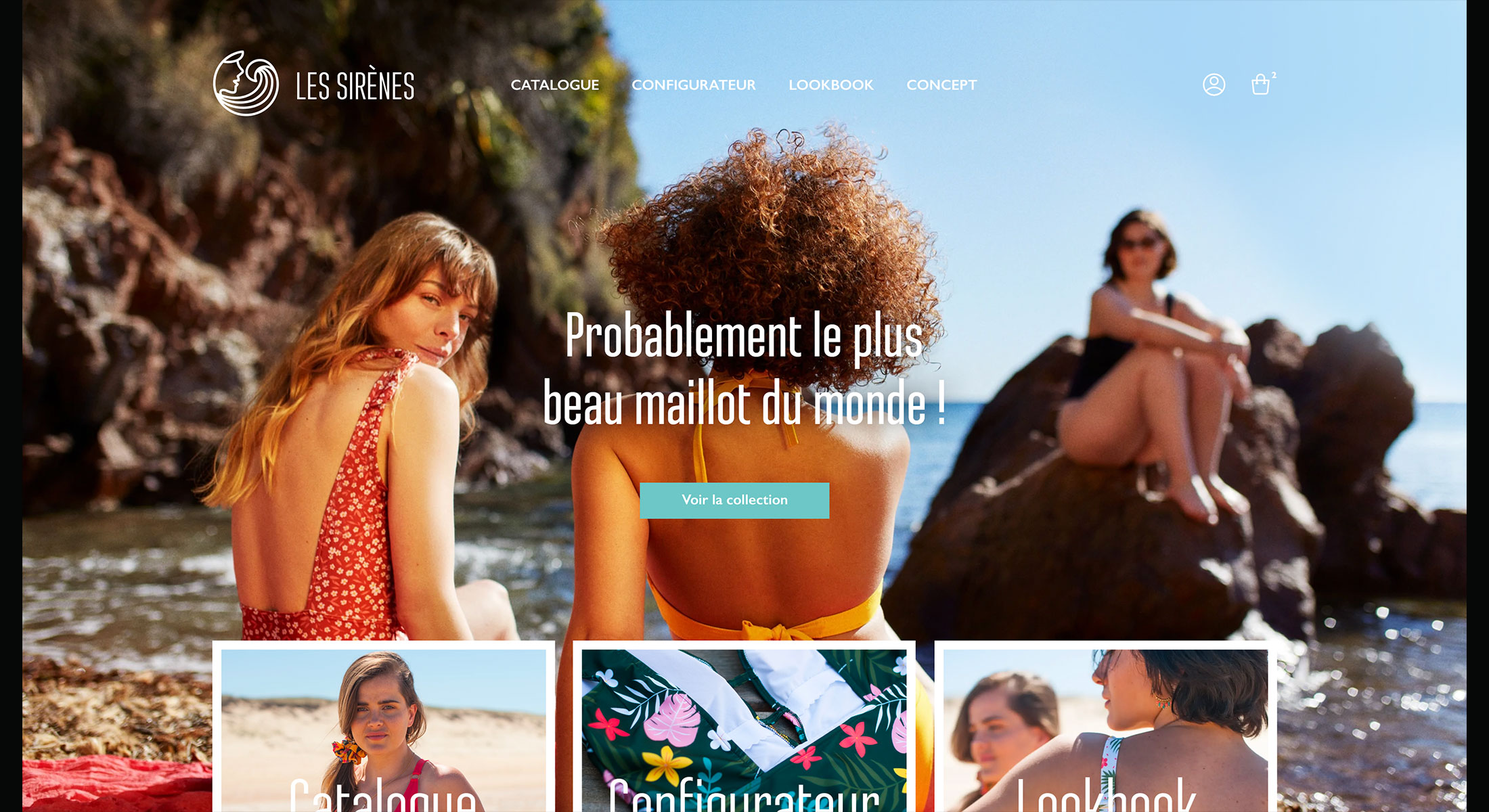

Guiding users towards website’s main feature
Accordingly to brand’s philosophy, finding the perfect bikini should be simple and stressless. In order to help users making their way as easy as possible towards website’s main feature, the configurator is strongly promoted and can be reach from many different locations along the navigation experience.
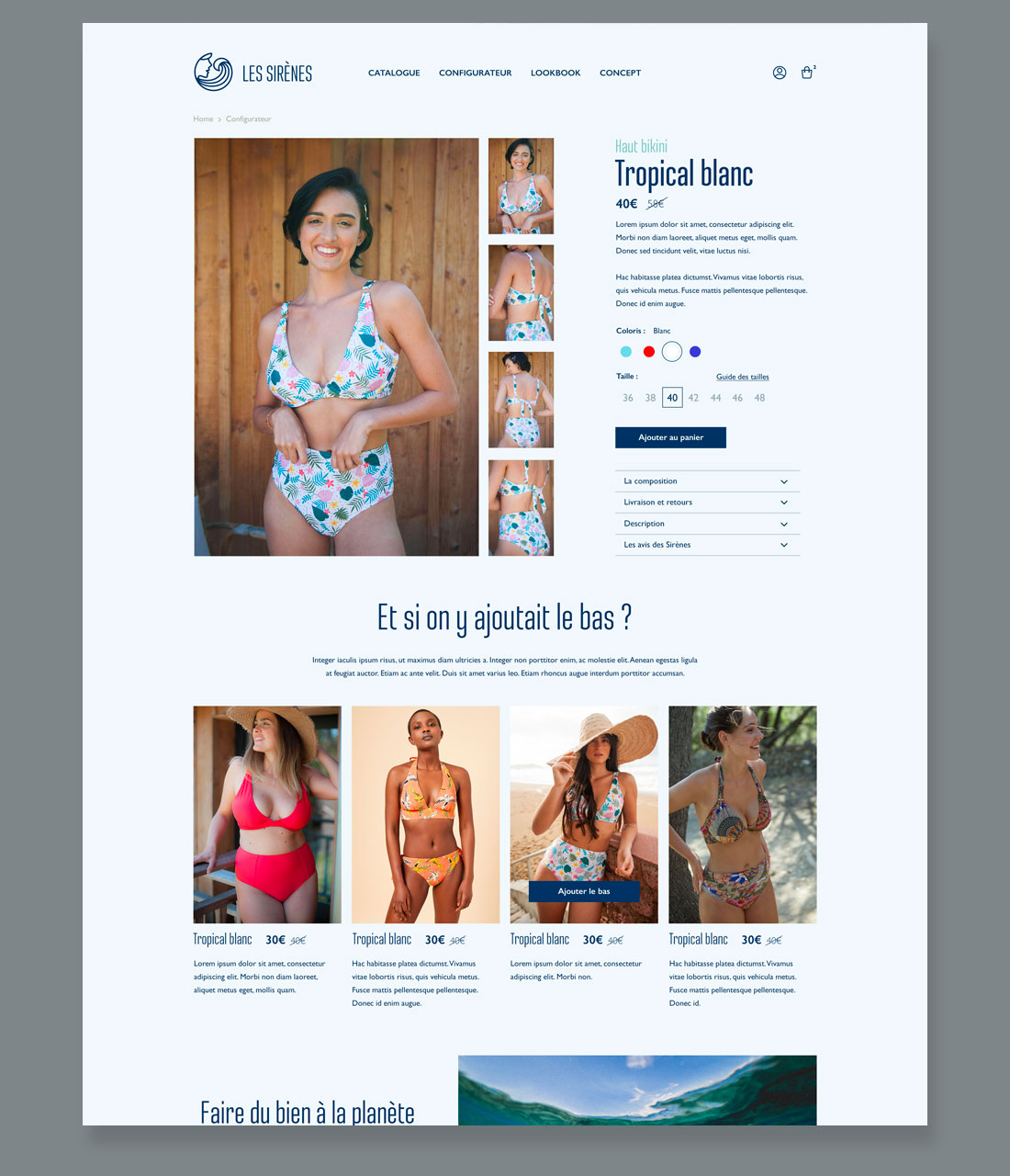
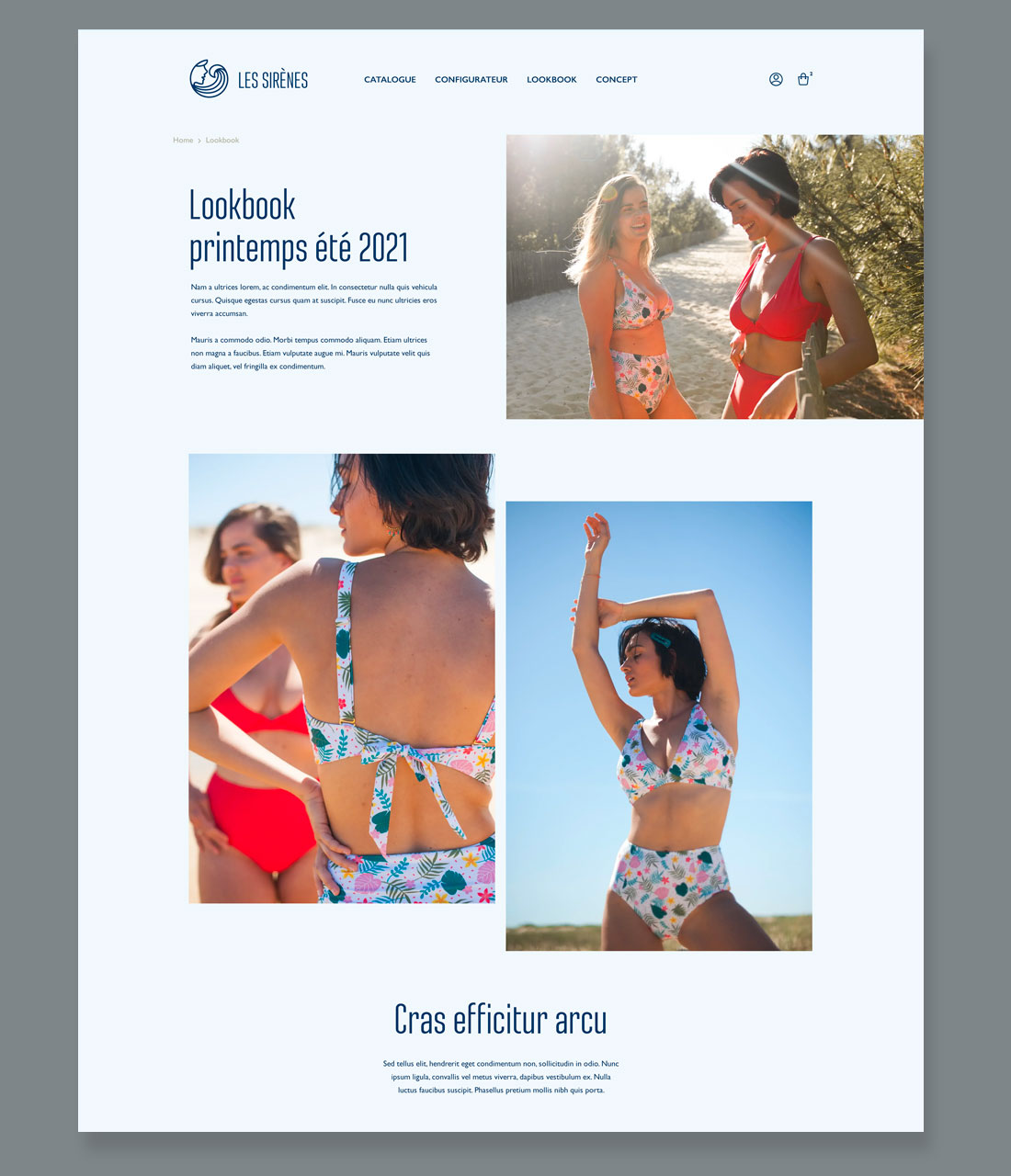
The product, heart of user’s attention
Inspiring and dreamy, the photography invites customers to their next summer holidays. Through lifestyle pictures, the product is presented from all its aspects: comfort, style, confidence. Pages structure is made to set the right scene for pictures, at the center of user’s attention.
Right on tone, out of grid
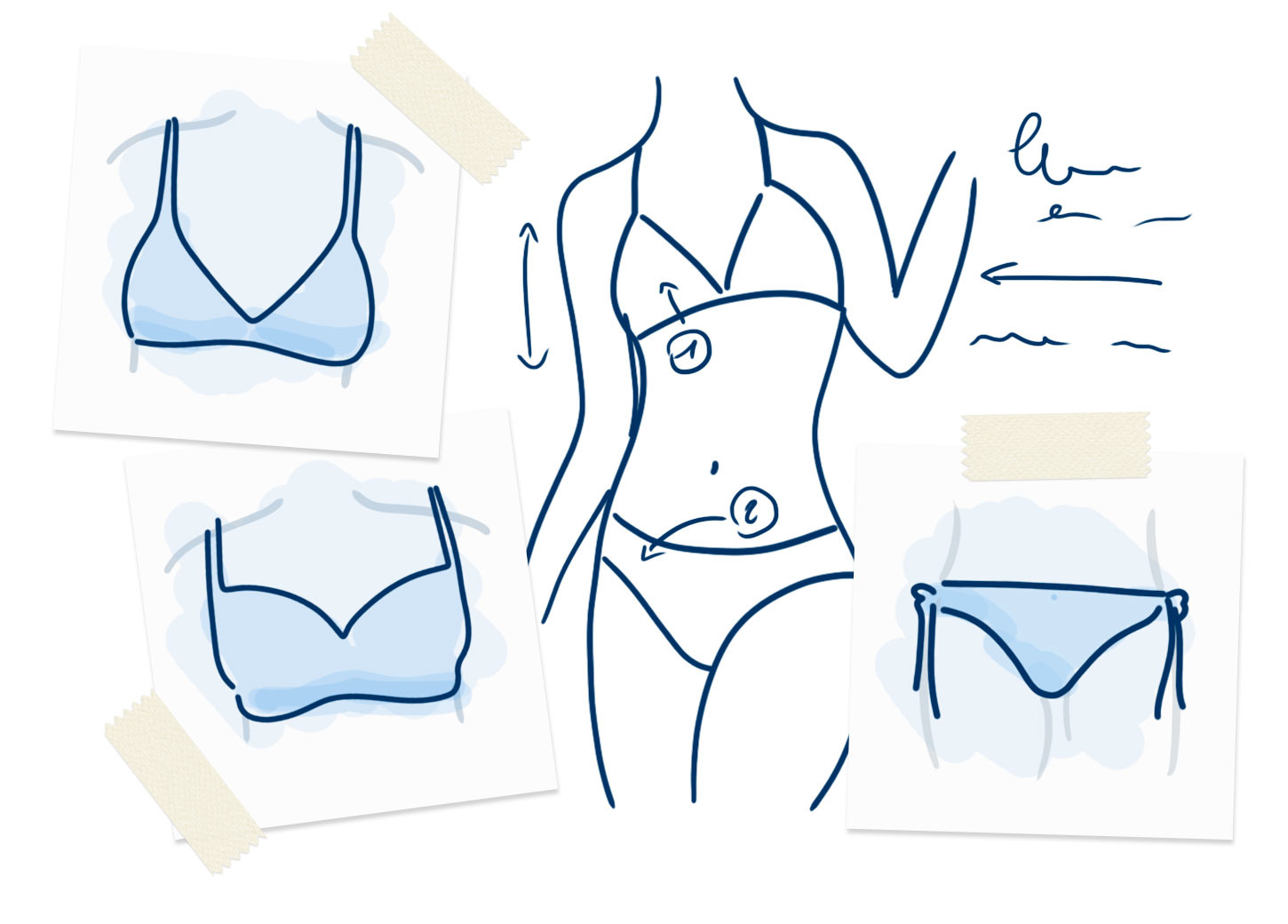
When it comes to highlight specific interactions, a strong contrast can give visual hints about what the company expect from customers. Not to mention the sketchy style to help the user understand what the next page is about.
Thank you for your time!
2022
2022
